Holiday Van Direct Mail
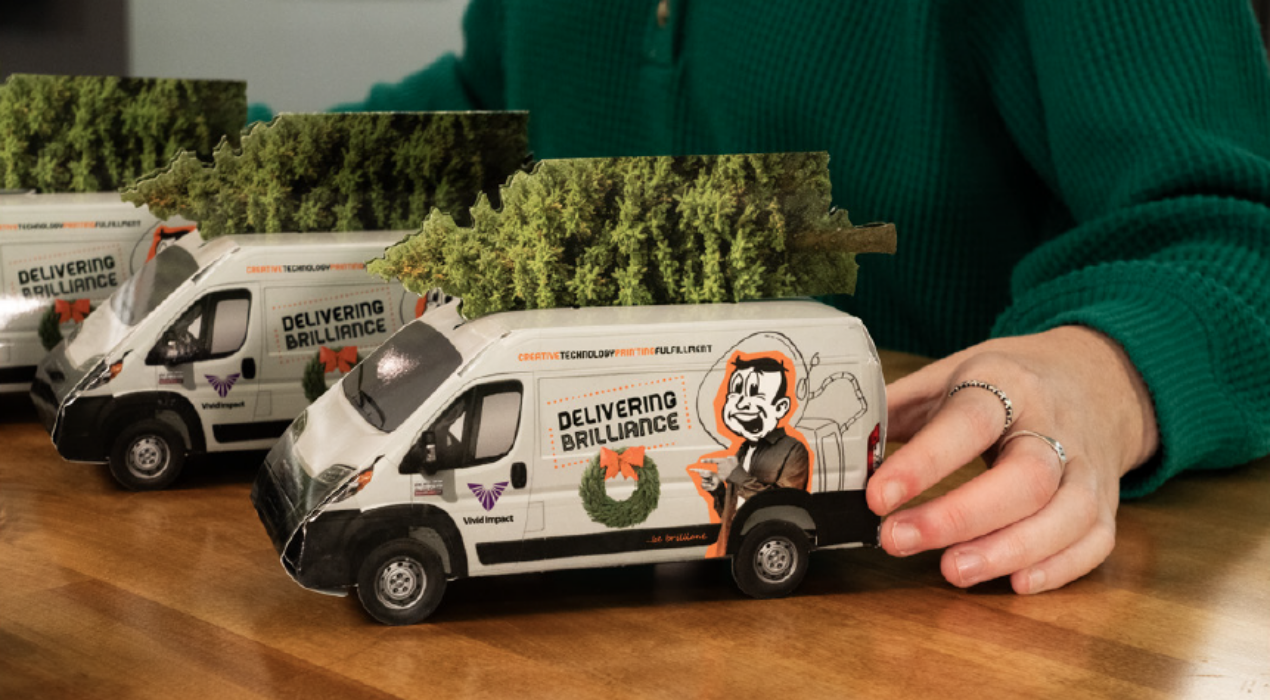
This direct mail piece is a miniature replica of our delivery van, designed to ship flat for easy handling. With step-by-step assembly instructions printed right on the piece, recipients can effortlessly fold it into a fun, 3D display—bringing a little piece of our service right to their doorstep.
Read More ›
American Advertising Awards Campaign – Win City
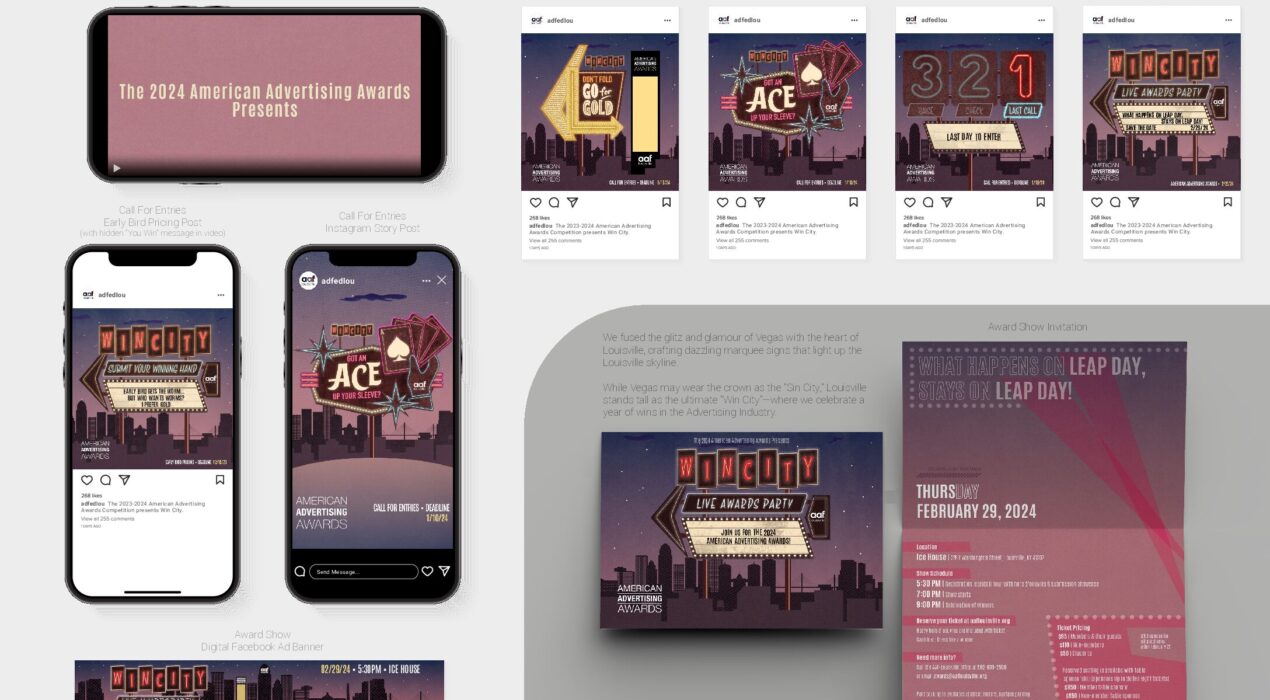
My team created the creative for the 2024 American Advertising Awards. Fusing the glitz and glamour of Vegas with the heart of Louisville, crafting dazzling marquee signs that light up the Louisville skyline. While Vegas may wear the crown as the “Sin City,” Louisville stands tall as the ultimate “Win City”—where we celebrate a year of wins in the Advertising Industry.
Read More ›
Precision POP Landing Page
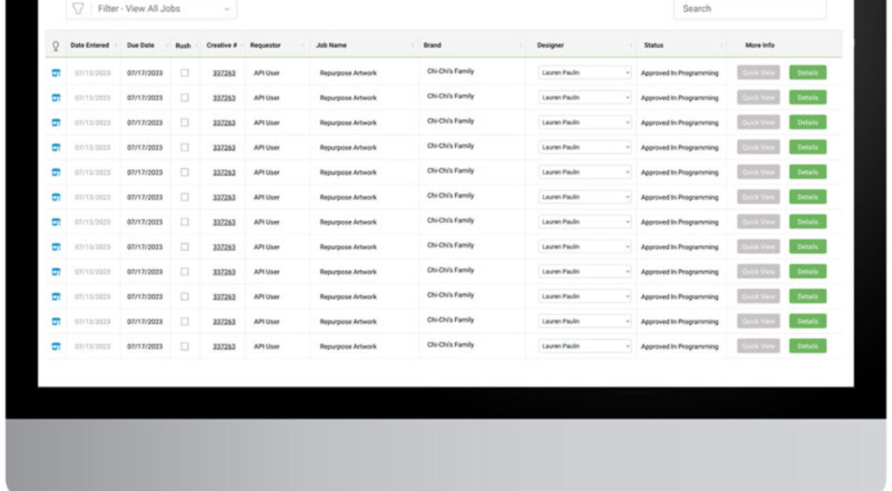
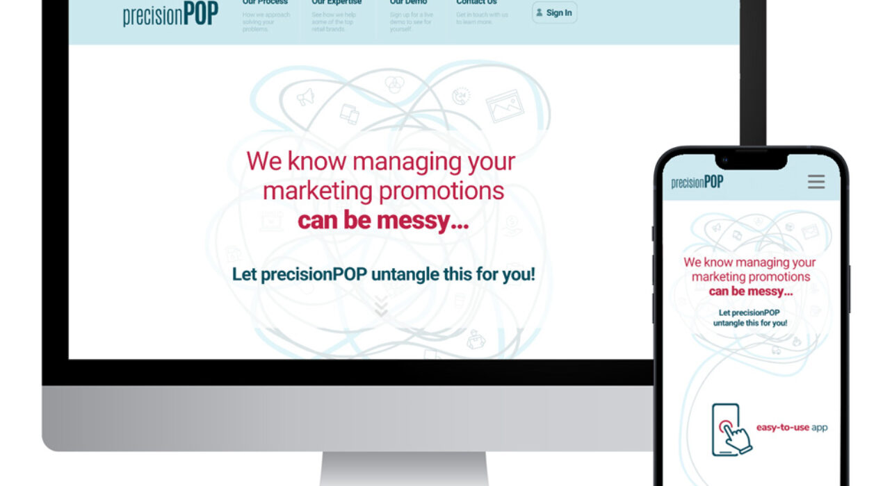
Vivid Impact’s internal campaing management software is called PrecisionPOP. This landing page would be the public facing site, providing information on the software. Our team created the assets, include the motion graphics and copy.
Read More ›

Wee Bonny Castles Album Art
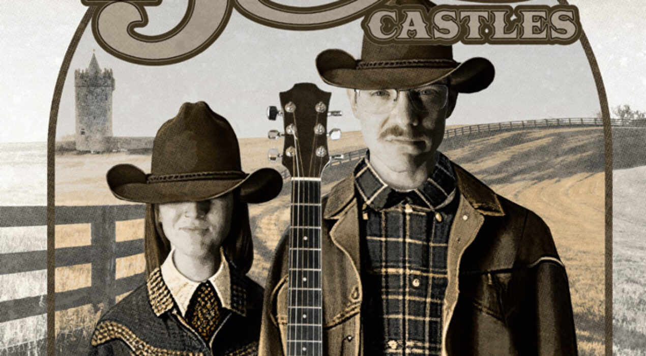
I entered our team into an album cover design contest by the American Advertising Awards. Our team was only given a band name and a genre, the rest was up to us. We were given the band name, Wee Bonny Castles, and genre, Country. We first developed the backstory behind the imaginary band called, Wee Bonny Castles: “The Wee Bonny Castles are a country music duo with music inspired by Kentucky’s bluegrass history and Louisville’s Irish heritage. The duo are of Irish descent and grew up in rural Kentucky, surrounded by rolling hills and horse farms.” The design was inspired by the painting, “American Gothic,” which shows a man holding a pitchfork with his daughter outside their home in rural America. Similar to the famous painting, the country duo is holding their trade tool, a guitar, and is standing in front of their two homes; the rolling hills of Kentucky and an Irish countryside. The whimsical font with an old country western feel gives a hint of what type of music to expect – bluegrass combined with Irish folk. We also added a halftone texture design that resembles a vintage book cover. Finally, we used Augmented Reality to make the […]
Read More ›
Muhammad Ali Wall Art
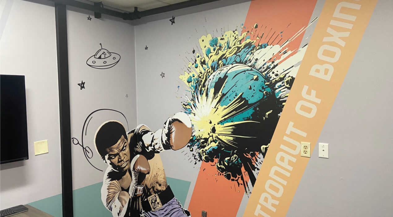
At Vivid Impact, our internal brand strategy is to emphasize our tagline “Be Brilliant” with inspirational figures that embody this phrase. This would be executed by creating a series of wall graphics to motivate and inspire the internal team members and clients during office visits. Muhammad Ali was an easy first choice based on his significance to the Louisville community. Ali was quoted in an interview saying, “I’m the astronaut of boxing”, meaning he’s the best of the best. This perfectly aligns with the Vivid Impact visual theme of outer space, innovation and mission. The Ali graphic was created with AI and then edited to fit our theme. The placement of the wall graphic at the corner was intentional because it feels as if he is punching around the wall toward the viewer, adding dimension to flat art.
Read More ›
Woodford Reserve Thousand Dollar Mint Julep Mailer
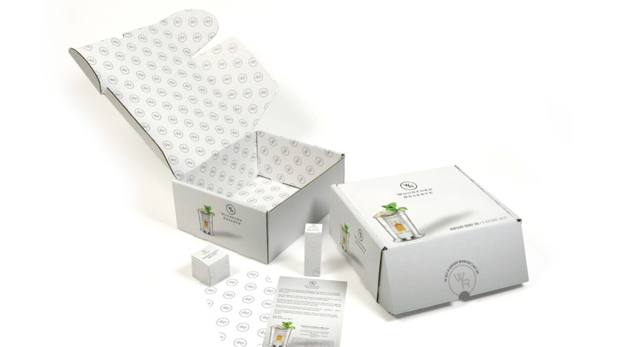
Woodford Reserve’s $1,000 Mint Julep Program holds special significance as it generates PR both locally and nationwide for the Woodford Reserve brand. Many customers look forward to purchasing the collectible cups every year on the day of the Kentucky Derby. However, in 2020, due to the Covid-19 pandemic, the execution at the track was cancelled. The goal of this project was to safely deliver the cups and ingredients to the consumer’s homes in time for race day. After the decision was made to keep fans and vendors from the track during the 146th Kentucky Derby, Brown-Forman needed to pivot their plans quickly and complete the project on an expedited timeline.
Read More ›

Little Lou Flower Truck
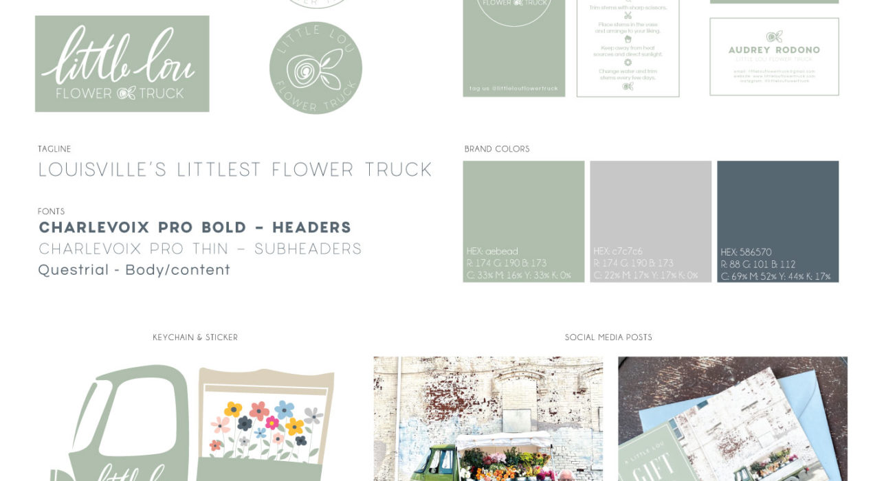
Little Lou Flower Truck is a company started by my wife and I created the brand, web and print assets as well as marketing campaigns through email and social media. The truck is usually the best conversation starter so here is more info about it: Little Lou is a three-wheeled 1977 Piaggio Ape (pronounced “ah-pay”) – originally produced in Italy, imported to San Francisco, and then transferred here to Louisville, KY to realize his potential as Louisville’s littlest flower truck. We had Little Lou converted from it’s original two-stroke engine to a completely electric drive train – so it’s now green in more ways than one! Yes, we do drive Little Lou on the roads. No, he doesn’t go far and he doesn’t go fast. (So please be patient if you happen to get caught behind us on the roads!) Nowadays, you’ll find Little Lou popping up around town on the weekends, filled with locally-grown flowers for you to build a one-of-a-kind arrangement with. We’d love for you to stop by and say hello!
Read More ›
Map Art Design & Print
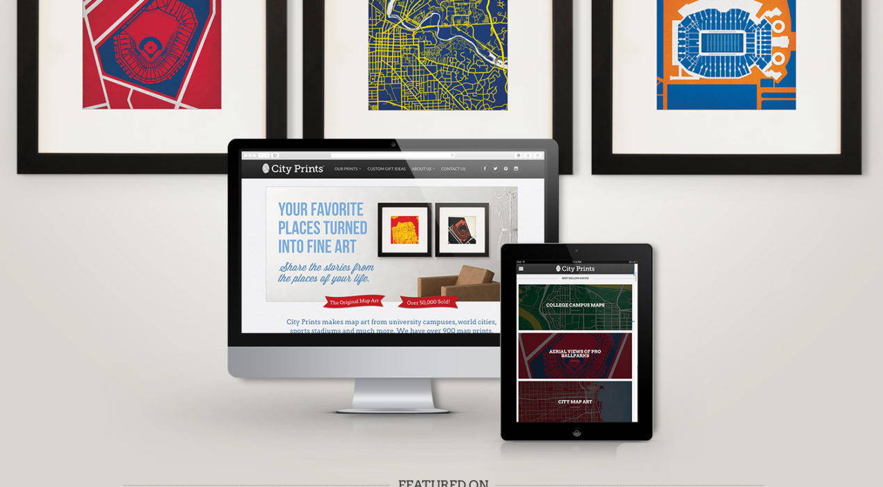
City Prints designs high quality modern map art prints on a variety of mediums. Some of the popular product lines includes college campuses, sports stadiums, and hometowns. As a designer, I create the art prints, update website graphics and developed integrated marketing campaigns through email, online ads, and social media – my favorite being the “What’s That Map Wednesday” campaign, where followers would participate in map related trivia for a prize. As operations manager, I set project priorities, develop implementation plans, set deadlines, and coordinate with printing and fulfillment teams.
Read More ›
Creek To Peak 4 Miler Event Poster
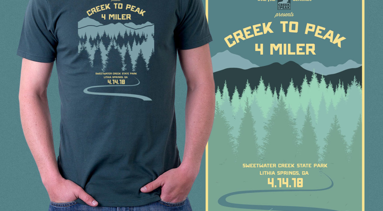
The Creek To Peak 4 Miler is a new race in the 2018 Greater Atlanta Run Series. The style needed to match the other races in this series. I was given complete freedom to brand this new event. This poster will keep the same design for the next few years with only minor color changes from year to year. Therefore, it need to be modern and distinguishable.
Read More ›
Ore 4 Miler Event Poster
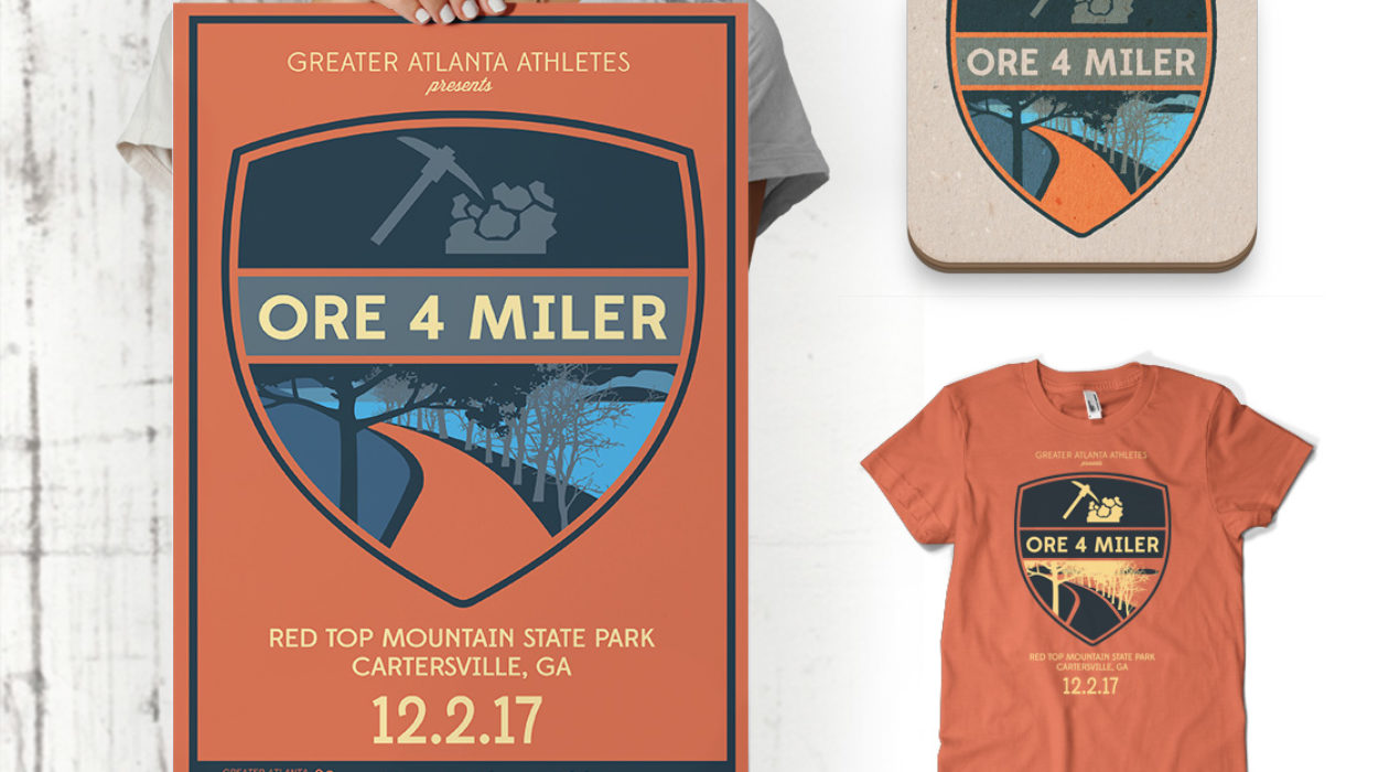
The Ore 4 Miler is a new race in the 2017 Greater Atlanta Run Series. There are 4 other races in this series and I was tasked to created a race poster for the event that matched the style of the other races. The other race posters include stylized renderings of the landscape from each race’s location. I received an image of the park where the Ore 4 Miler is located and recreated an image to match their style. I also added an axe and iron ore together in a crest to tie the name and location together.
Read More ›
Sims Dentistry of Louisville
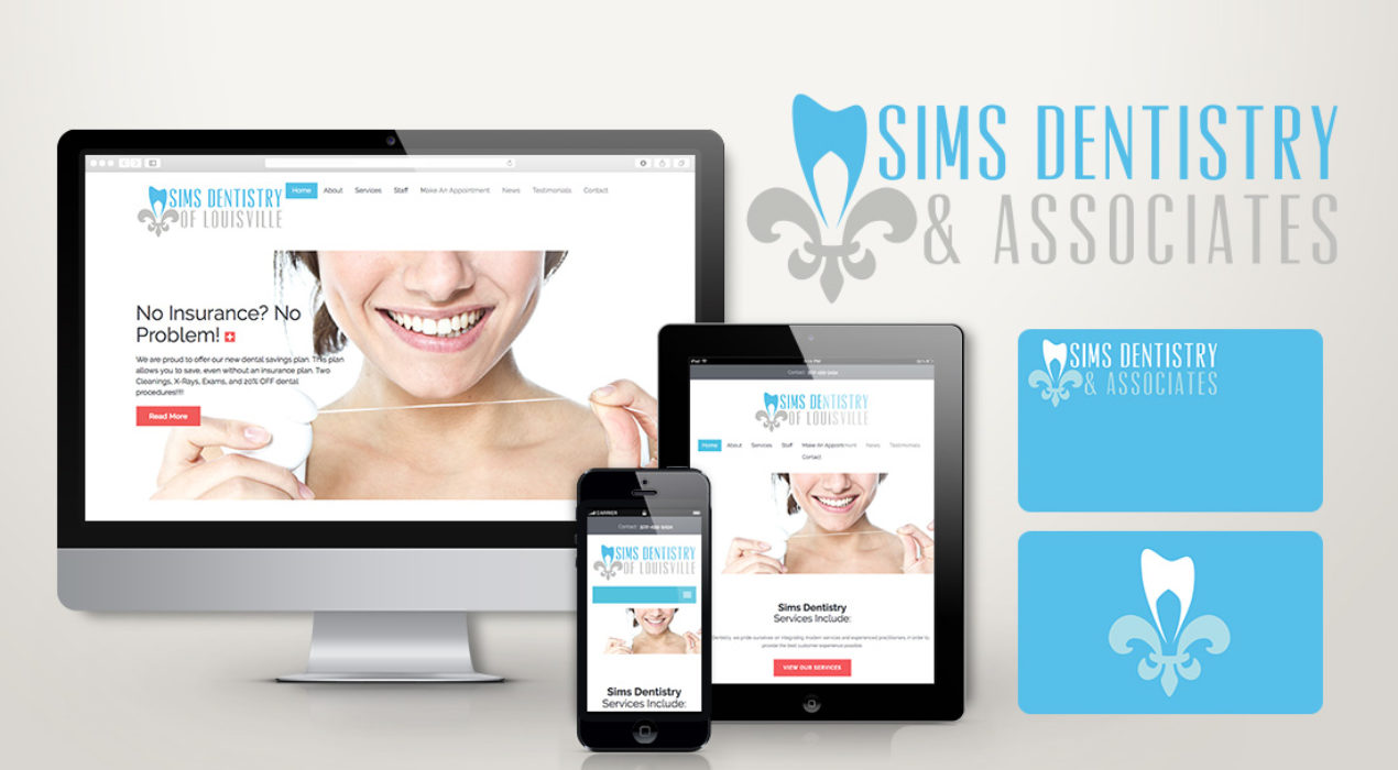
Sims Dentistry of Louisville needed a brand overhaul with a fresh logo and website. The practice wanted a bright and modern twist to target a younger generation. The logo would be used on a variety of products, such as signage, uniforms, and promotional material. All the dentists were raised in Louisville so using the symbol of the city, the flour de lis, I created a tooth in the top to tie their career and hometown together. The website is simple and clean, emphasizing their goal of simple and clean dentist appointments. They wanted limited information to overwhelm the visitors because let’s face it, going to the dentist is sometimes overwhelming enough! The website used a WordPress CMS so the office could update content as needed.
Read More ›
Anvil Strength and Conditioning
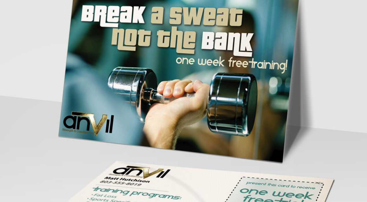
Anvil Strength and Conditioning wanted to promote their sports specific training through personal and group classes. They needed a 8.5″ promotional card to get people in the door by advertising “One week free training”.
Read More ›
Hunter & Maverick Branding
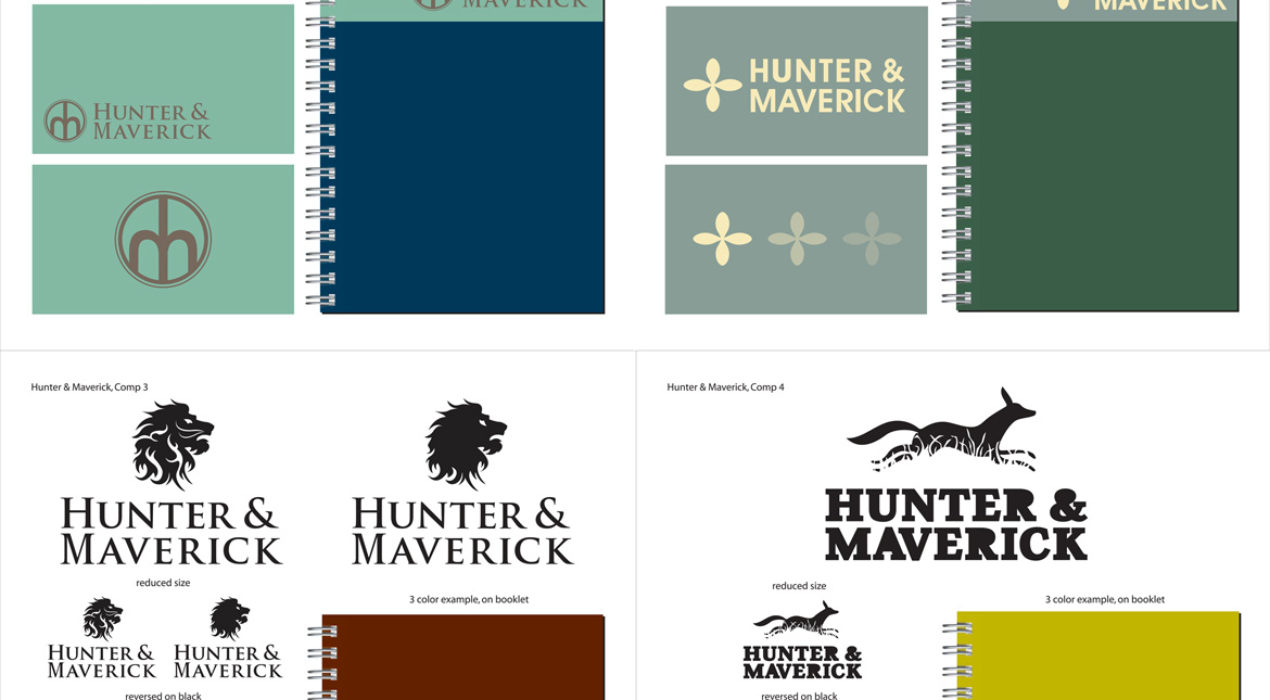
Hunter & Maverick is a law firm who wanted a logo that promotes strength and intelligence. I created four different concept variations: Comp 1: A strong bond is formed from the letters “h” and “m”, promoting strength and stability. Comp 2: An ancient African symbol that represents strength and perseverance Comp 3: A lion head that represents strength and power Comp 4: A fox represents that stability and intelligence
Read More ›
Elite Wellness
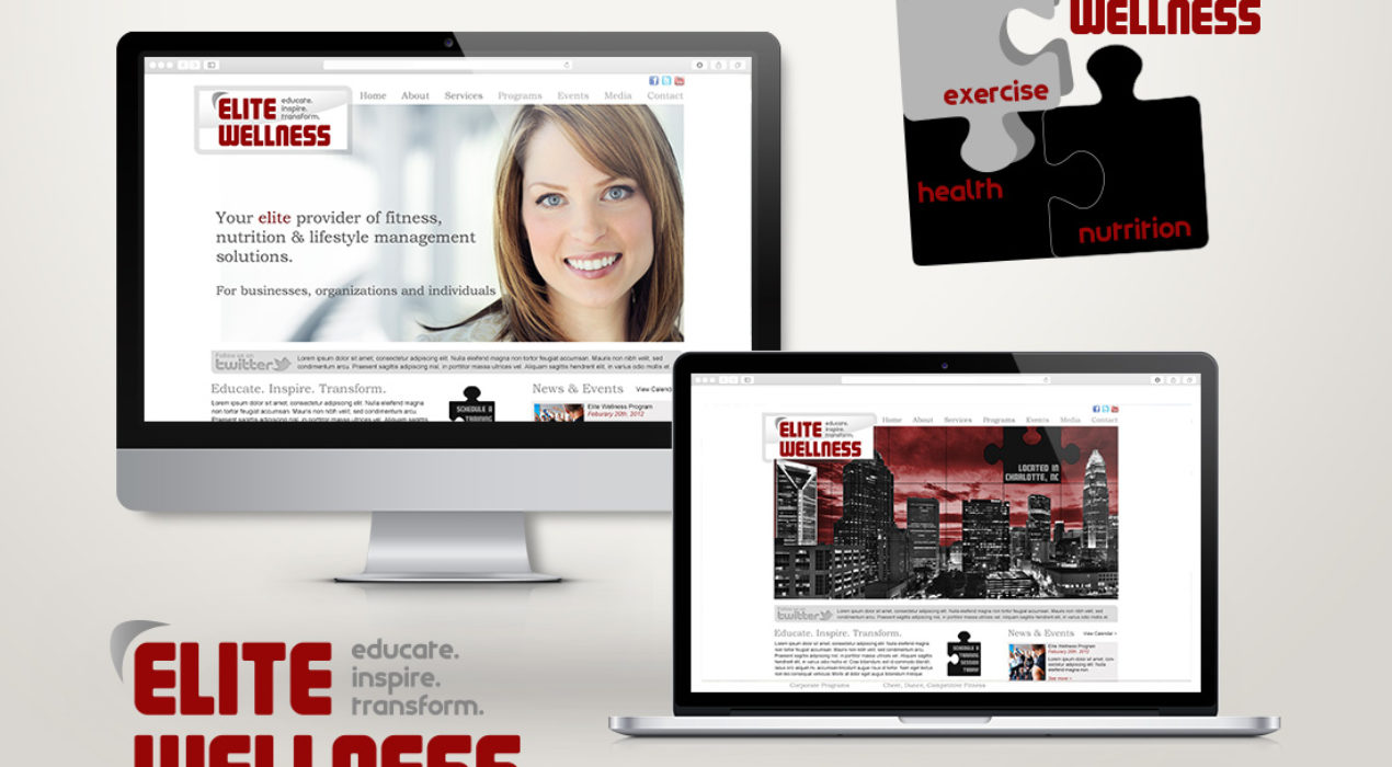
Elite Wellness is a personal training company that offers on-site training at corporate offices. Their main focus is creating fitness programs for office life. First, a logo: A puzzle design was introduced to show that the missing puzzle piece, for a lot of people, is wellness. In the high-stress environments of corporate life this is especially true. Elite Wellness focuses on 3 areas: exercise, health and nutrition. By maintaining these 3 areas, an individual will achieve the missing piece: Elite Wellness! Next, the website: Their biggest need was a place to showcase their services to corporations as well as promote healthy lifestyle advice through a blog. Keeping information and news up to date was very important so I installed a WordPress CMS for the client to add content, photos, and news.
Read More ›
AIM Fitness
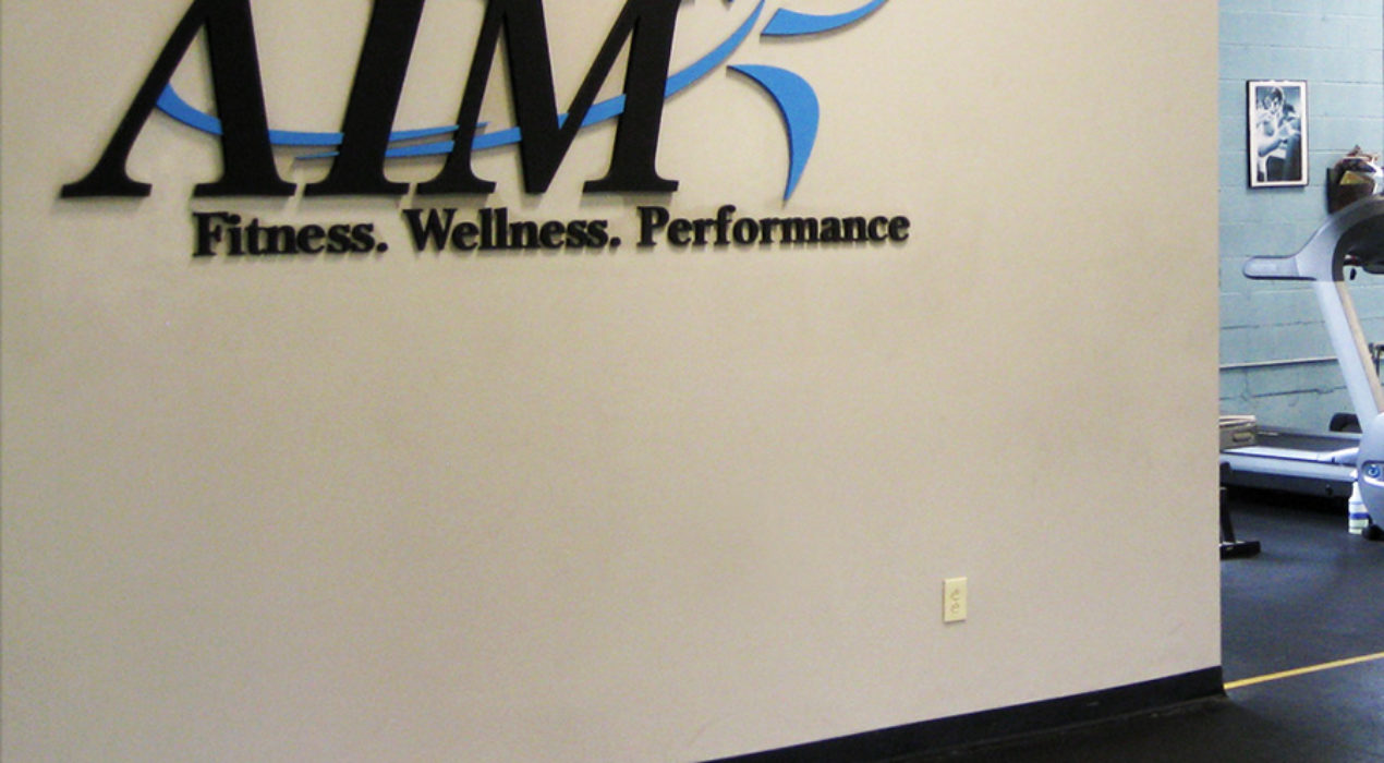
A local Charlotte personal trainer branched out to start his own company. His concept was easy, “to promote wellness, fitness, and performance”, which became his company’s slogan. I created a logo that was modern, sleek, and indicates a fast-paced environment to burn those calories quickly!
Read More ›
