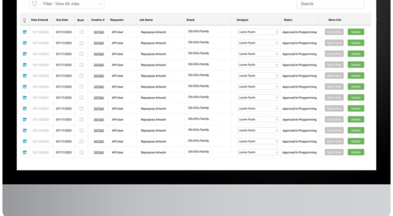
Nutrabolt Mobile Site
Project goal was to localize POS material without printing lots of different versions. The concept was created using Abode XD to present to the client. Concept: The visitor would scan a QR code that would take them to this mobile site. The site would use their location to direct to the local MiLB team landing page that we would create. From here, they could to buy tickets, view schedule, view promotional calendar, and learn about the venue and where their products are being sold.
Read More ›
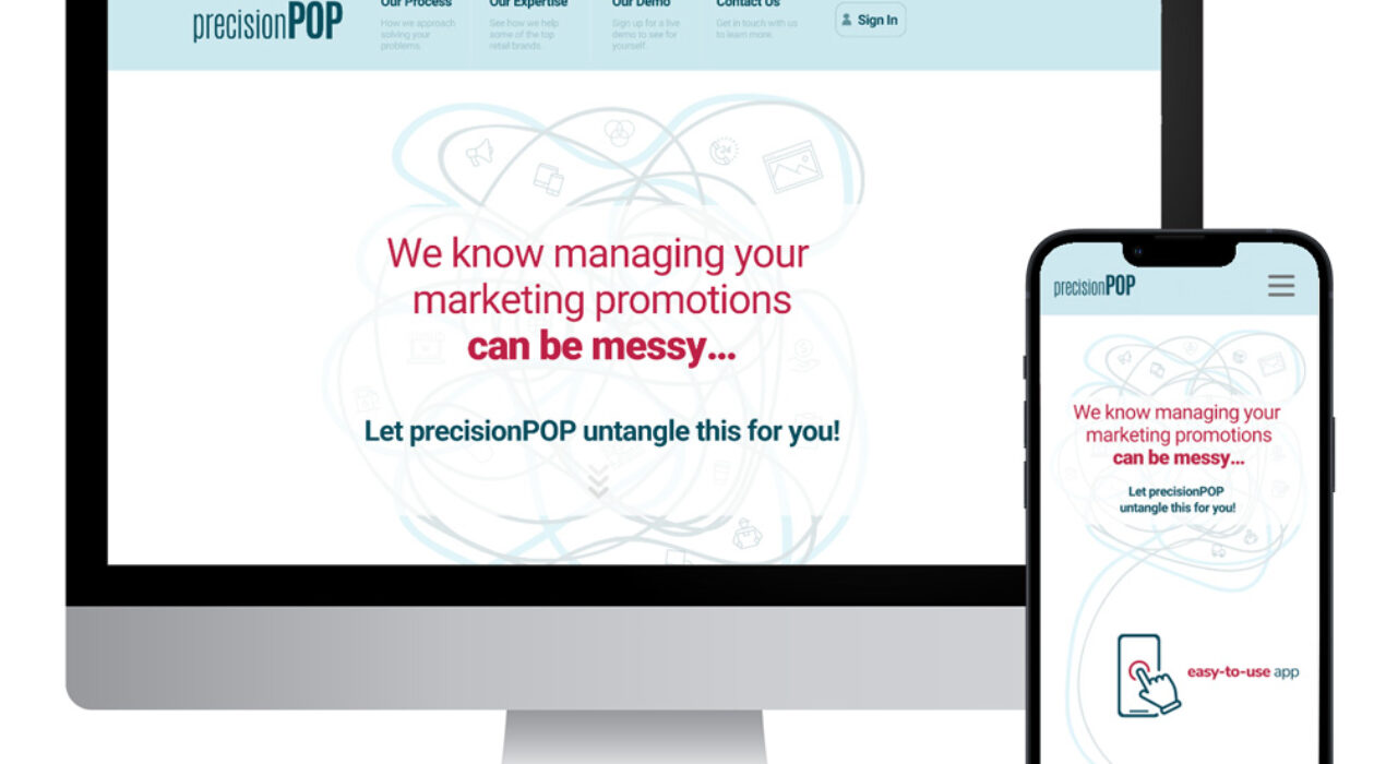
Precision POP Landing Page
Vivid Impact’s internal campaing management software is called PrecisionPOP. This landing page would be the public facing site, providing information on the software. Our team created the assets, include the motion graphics and copy.
Read More ›
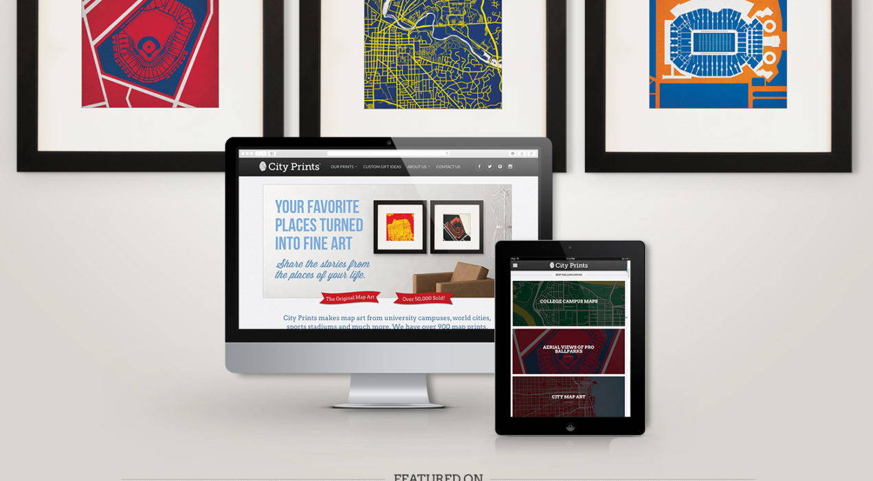
Map Art Design & Print
City Prints designs high quality modern map art prints on a variety of mediums. Some of the popular product lines includes college campuses, sports stadiums, and hometowns. As a designer, I create the art prints, update website graphics and developed integrated marketing campaigns through email, online ads, and social media – my favorite being the “What’s That Map Wednesday” campaign, where followers would participate in map related trivia for a prize. As operations manager, I set project priorities, develop implementation plans, set deadlines, and coordinate with printing and fulfillment teams.
Read More ›
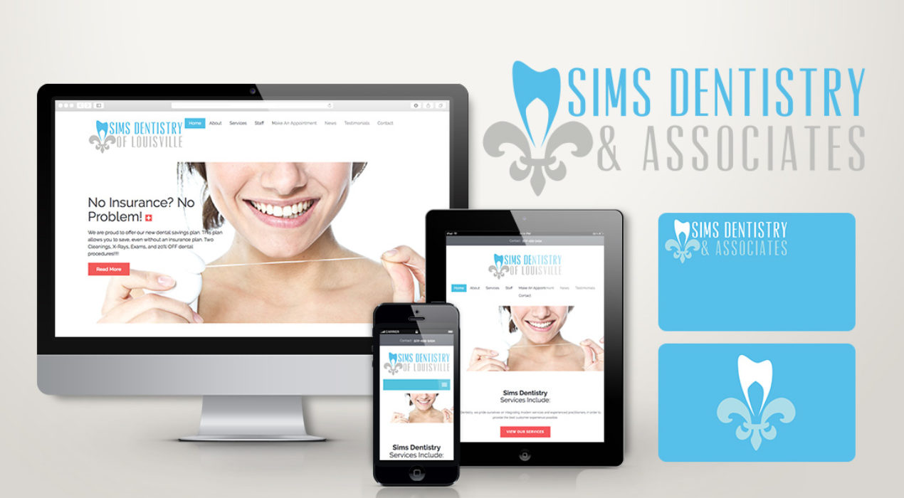
Sims Dentistry of Louisville
Sims Dentistry of Louisville needed a brand overhaul with a fresh logo and website. The practice wanted a bright and modern twist to target a younger generation. The logo would be used on a variety of products, such as signage, uniforms, and promotional material. All the dentists were raised in Louisville so using the symbol of the city, the flour de lis, I created a tooth in the top to tie their career and hometown together. The website is simple and clean, emphasizing their goal of simple and clean dentist appointments. They wanted limited information to overwhelm the visitors because let’s face it, going to the dentist is sometimes overwhelming enough! The website used a WordPress CMS so the office could update content as needed.
Read More ›
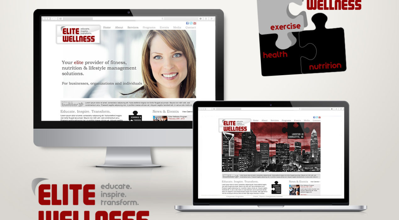
Elite Wellness
Elite Wellness is a personal training company that offers on-site training at corporate offices. Their main focus is creating fitness programs for office life. First, a logo: A puzzle design was introduced to show that the missing puzzle piece, for a lot of people, is wellness. In the high-stress environments of corporate life this is especially true. Elite Wellness focuses on 3 areas: exercise, health and nutrition. By maintaining these 3 areas, an individual will achieve the missing piece: Elite Wellness! Next, the website: Their biggest need was a place to showcase their services to corporations as well as promote healthy lifestyle advice through a blog. Keeping information and news up to date was very important so I installed a WordPress CMS for the client to add content, photos, and news.
Read More ›